Category Archives: Uncategorized

Uncovering new information for a Wayzgoose Talk


WAYZGOOSE 2019 header graphic-A2AC (1)

For the past couple months I’ve enjoyed preparing to give a talk on October 11, 2019 about the Bentons, at the University of Michigan’s Clark Library, for the Ann Arbor Wayzgoose and Printing Festival.

Doing research is like detective work, like trying to put together a giant puzzle, but you have no idea what the final outcome will be. I added a lot of new material to this talk. For example, did you know that Linn Boyd Benton got a patent for a needle used to attach price tags to cloth?!

Researching the Bentons introduced me to very interesting people, some of whom became lifelong friends. In 1984 I spent hours listening to Morris Benton’s delightful daughter Caroline tell stories about her father and grandfather at her home in Milwaukee. Her son, Larry Gregg, corresponded with me for years, and attended the book opening here in Rochester. He still has some of Morris Benton’s magic tricks.

Just about two weeks ago I found some recent rebuttals to Beatrice Warde’s story about Garamond,  and posted a new story about Morris Benton’s Hobo, thanks to Peter Zelchenko’s amazing essay, linked below. (I heartily disagree with Zelchenko’s analysis of Morris Benton’s character!)

Erik Larson’s “The Devil in the White City” gives the perfect backdrop for a Benton factoid: Linn Boyd Benton’s punch-cutting machine was judged to be the most perfect mechanical exhibit in the 1893 World’s Columbian Exhibition in Chicago. That detail didn’t make it into Larson’s book, but it’s on page 69 in the Benton book.


Morris Benton’s Hobo type


Figure17-37

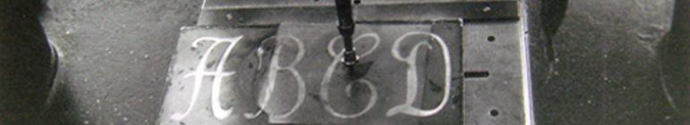
Hobo (1912) is one of the starred typefaces on the partial list of Morris Benton type designs, compiled by him in 1936, and sent as an internal memo to ATF’s sales promotion department. Benton explained that, “The ones with a * could be selected for a shorter list if the whole list is considered too long for the article.”

So it’s obvious that Hobo is Benton’s own work, not a collaboration. Benton was a master at reviving types, and he also designed a wide range of gothics. He designed Broadway, which was quickly copied by Sol Hess for Monotype, and is still used to evoke the Roaring Twenties era. These few examples establish Benton’s chops as a type designer.

But perhaps it’s still legitimate to ask: Where did the idea for Hobo originate? One possible answer comes from Peter Zelchenko, a computer expert, formerly of Chicago and now living in Japan, who emailed me a few years ago with his idea. Zelchenko’s long explanation of Hobo’s origins is excerpted below, but before reading it, be aware that:

18-4 cropped

Morris Benton was a heavy smoker. It’s possible that, like every other “hobby” Morris Benton pursued, his taste in tobacco encompassed a wide variety of brands. In 1906, Morris and his family moved to Plainfield, New Jersey, where they lived for the rest of their lives. Morris and his father took the 7:20 a.m. Jersey Central train every morning to ATF’s Jersey City plant, about 20 miles away.  He owned cars, but drove them for pleasure, not to commute to work. So where did he buy his tobacco? At a corner store on the way to ATF? On Saturdays (half work-days at ATF), when he was out driving around with his family? Anybody’s guess, but it has been well-established that he was adventurous by nature. He may have bought his tobacco anywhere. He would have been interested in printed advertisements for tobacco, too.

Why bring up smoking? Zelchenko suggests that Morris Benton must have seen the Russian, hand-lettered, four-by-five-foot Art Nouveau advertising poster for Duchess Tobacco that Zelchenko found by chance in a Russian poster art book.  At the top of the poster is the word HOBO, the Cyrillic spelling of the word Novo (“New!”).  I agree with Zelchenko, that this hand lettering likely inspired the typeface. Frankly, the name Hobo is too unusual to be explained any other way.

Zelchenko states: “Perhaps [Morris Benton] was somehow reluctant to admit that the source of his inspiration came from outside his famously insecure mind.” Famously insecure? Where did that come from? Here, I totally disagree with Zelchenko. It’s exactly the opposite. Morris Benton was extremely secure, which is why he didn’t go around boasting or explaining his every action.   

Several writers have mischaracterized Morris Benton in the same way. He was a private person, that’s all. Did he owe anyone an explanation of where Hobo came from? No. And even if he did explain it, to Henry Lewis Bullen, for example, that may have been where the conversation ended. I guess my conversations with Morris Benton’s daughters and grandson have given me a different view of who he really was.            –PC


Hobo left hand page cropped

Here’s an excerpt from Peter Zelchenko’s essay:

Morris Fuller Benton was the contented son of Linn Boyd Benton, the latter one of the most influential figures of all time in the graphic arts, arguably ranking somewhere near the pantheon among Gutenberg and Bi Sheng. Through the 19th century, the Wyeths did painting, the Brontës did writing—and the Bentons did type. Every industry in every age has its salon powerhouses, those titans whose magic could rub off on you if you could only get near enough. But of course unless you actually were family, often nothing was bound to happen. Grandpa Benton, as it happens, owned the Milwaukee Daily News and also became a congressmen, and his father in turn was a prominent East Coast physician. In fact, Grandpa was under consideration as a presidential candidate but lost out to Stephen Douglas. Patricia Cost wrote a wonderful history about the Benton family that tells even more. But, nepotism aside, Morris Fuller became quite a prolific and celebrated type designer in his own right, surpassed by only a few others in the number of iconic font designs to his name.

The two main stories behind the naming of Hobo are both probably apocryphal. The first is that the bow-legged shape of the letters suggested the legs of a hobo. The second is more creative, but it too lacks much support. According to one writer, Emil Klumpp of ATF gave a talk at the APA Wayzgoose conference in 1977 and mentioned the origin of the name. In his 1993 book American Metal Typefaces of the Twentieth Century, historian Mac McGrew apparently summarizes Klumpp’s report:

“One story is that it was drawn in the early 1900s [when Art Nouveau was still in fashion] and sent to the foundry without a name…but further work on it was continually pushed aside, until it became known as ‘that old hobo’ because it hung around so long without results.”

* * *

McGrew died a few years ago, as did Emil Klumpp, but I wish they were still alive so that we could debate these facts. Both were born long after the font. There is absolutely no evidence that the font’s design was begun earlier than 1910; that speculation may well owe itself only to its convenience to the story itself. Something just doesn’t seem to add up. We have, however, harder facts.

The quintessential nerd, James “Kibo” Parry worked on the Atari 2600 design team. He became a household name on the early Internet by haunting Usenet newsgroups and contriving numerous online larks to amuse the digital populace, which at the time did not yet number 50,000 or so worldwide. Kibo once had a two-page feature all to himself in Wired magazine. He had a religion called Kibology named after himself, with a bizarrely popular online discussion group of thousands of subscribers.

Kibo was even immortalized in the Geek Code, an early Internet fad that one would put in the signature of one’s e-mails and online posts to indicate level of geekiness and hence high-tech social status. There were several indicators, such as how well you knew the C language, or whether you were Unix (good) or MS-DOS (bad). The number of pluses after a letter code indicates the level of accomplishment. C is, predictably, C, and the Unix/Windows letter codes are U and w.

There is even a flag for how close one is to Kibo. At the top end, it included: “K++++ I’ve met Kibo,” “K+++++ I’ve had sex with Kibo,” and “K++++++ I am Kibo.” At the bottom are several negative indicators, such as “K–” I dislike Kibo. I have the dubious distinction of being somewhere close to the K+++++ category, because technically I’ve, uh, slept with Kibo—well, at least I’ve shared his bedroom. Here is Kibo’s own e-mail signature which, although over 1,000 lines long, does not include a Geek Code. But it does give you an idea of the strange humor that is Kibo.

Apart from all of this, Kibo is also a lover of type, and very knowledgeable about it. He and I were wandering around downtown Boston sometime around 1992, the morning after a rather snooty ATypI wine-tasting event hosted by David Berlow’s Font Bureau, celebrating Matthew Carter. Seeing the well-dressed and well-paid scions chatting and sipping red wine, it was impossible to picture us really fitting in there. And, of course, nobody paid the least attention to us.

Another time, in 1994 in San Francisco, ATypI met, and the pushy, competitive nature of the nascent PostScript font industry took a more direct form. The Dutch youth, Erik van Blokland, Luc de Groot, and brothers Just and Guido van Rossum, had crossed the pond. There was a kind of technical mosh pit established as a playground for us 15 or so “youngsters” in which to create the show daily.

This playground was billed as a social collaborative activity. But I recall the four Dutchmen muscling over this and other activities with equal, shall we say, zeal. A couple of less pushy participants raised a stink to the elders and yet the rebellion was discreetly put down. As is the case in such societies, most of us budding young craftsmen were hoping for some attention, but we were not nearly as forward about it as these tough Europeans. To be sure, they had talent. But we, at least, were aware that our eyes and minds and skills were as ready as theirs. I recall Luc de Groot simply drawing the nameplate for the publication, without any discussion from anyone else. An arguably enviable post that he had simply arrogated to himself. My recollection is that his skills were not much up to the task that day and I was pretty certain that I could have done better. Again, that year, nobody paid any attention to us.

Kibo and I were bored out of our skulls that morning after the Font Bureau affair in Boston, and probably a bit hung over and cynical. Presumably, we were already heading toward failure in the type world. Kibo lived right across from the Commons, in a cockroach-infested flat dotted with empty carry-out containers. I had slept on the floor. Walking somberly through the streets of old Boston, Kibo showed me how to pick locks with the metal bristle from a street-cleaning truck’s brushes, which bristles, to my amazement, can be found near the curb of almost any street in the world. We shared work horror stories. We sneered at the cult of personality that was the typographic design world in those high-flying days. Frankly, we were probably a bit jealous. And of course we showed off by pointing at signs and identifying many fonts. We also stopped in at several bookshops.

At one particularly cozy little shop, I was flipping through a Russian poster art book, surveying a nice Art Nouveau poster for Duchess Tobacco. Kibo, looking over my shoulder, asked me what the poster said. I said it was for the “new and wonderful” Duchess Tobacco, 1/4 pound for 40 kopecks, from tobacconists Kolobova and Bobrova of St. Petersburg.

I think Kibo said something like, “Huh. Why does it say ‘Hobo’ at the top? Those guys don’t look like hobos.” Indeed, the two characters pictured helping themselves to a box of the Eastern-style cigarettes known as papirosi were young Russian gentlemen. But I explained to Kibo that HOBO was the Cyrillic spelling of the word novo (“New!”). It was then that we both noticed that the poster was drawn in something very like the font Hobo. Of course, this was hand-lettered, but it was certainly in that Art Nouveau splayed style. That led to speculation that Benton could have seen this poster or one like it in a Russian neighborhood. Certainly the four-by-five–foot poster in a window of a Russian tobacco shop or grocer would have been amusing to non-Russians seeing the word “HOBO!” at the top, and it could very well have inspired any talented type designer to throw together a font in its honor.

The Russian word “Chudno” (above) means “wondrous.” What’s really wondrous is the unique similarity of Benton’s majuscule O and the one drawn at the poster’s extreme right. The shape of the letters in the word “HOBO!” don’t hurt the argument, and of course the name buttresses it. To me, the striking coincidence of this single “O” letterform crowns the argument and should lay to rest the mystery of Hobo. This evidence shows that Morris Fuller Benton must have seen this poster somewhere. Perhaps he was somehow reluctant to admit that the source of his inspiration came from outside his famously insecure mind?

In fact, the “O” in the word “Чудно!” at the far right side of the poster looks as if it could have been traced by Benton as the model for his Hobo majuscule O. In fact, it is so close that it would arguably be more of a coincidence if this were not the case.

The characters “HOBO” at the top of the poster, their general design formula, and the identical shape of that O, I feel, lay to rest the hundred-year mystery of the source of both the font’s name and design formula. There was also motive, method, and opportunity. This is far better substantiation than what we have from the two chief theories that have circulated all these decades.

Moreover, what this suggests is that the original inspiration for Hobo probably was not Benton’s own mind, but the pen of an unknown graphic artist at the world-renowned Wefers lithographic press in St. Petersburg. It is not some great scandal that Benton failed to mention this, but it is true that Benton was famously insecure. Admitting that the source of the design of this font was something so pedestrian was not, and is still not, a common part of the ethical standard of the creative industry. It’s one thing for Carol Twombly (who once admitted to me that she didn’t know one end of a flat brush from the other) to acknowledge, even revere, the origins of Trajan. This is another thing entirely. In this case, you would think with such a cute origin, Benton would have been sharing the anecdotal pun with his pals at ATF. Perhaps he did and that history has been lost. Finally, if we believe the connection of the Hobo font to this Russian poster, then Benton’s naming of the font was very deliberately tied to Benton’s use of the poster as his exemplar.

I bought the book and gave it to my uncle Boris and aunt Tanya in Boston, and they probably still have it. The poster included details on the date, but I recall it was around 1903 or 1905, and that agrees with the design style.

As David Berlow has remarked, Morris Benton and his father often lived together and over the years would commute between home and the various locations of the ATF foundry in New York, later in Jersey City, and still later in Elizabeth. In fact, the northeastern New Jersey area where the Bentons lived, worked, and presumably played at the time had over 300,000 Russian Jews. We also know that at that time corner stores literally were at almost every street corner.

I don’t know for certain whether the Bentons’ travels went through any of the Russian neighborhoods. It seems that for the period in question they were probably living in Plainfield and commuting more than 20 miles, probably by car, to Jersey City. They may well have seen this poster at some point. Possibly they saw it in another place. Or perhaps Morris Fuller might have taken a trip to Russia around that time. That part is speculation. Perhaps Benton historian Patricia Cost could illuminate a bit.

In any event, while the type snobs were sipping fine wine, slapping one another on the back, and tooling around Boston in their nice cars, all paid by typography, a couple of bums momentarily came from out of nowhere, and went nowhere in particular. While there, they quietly and unceremoniously found a plausible solution to a celebrated typographic mystery, that of the origin of the Hobo font.


Tour of the Bixler Press & Letterfoundry

Preliminary talk

On Thursday, October 22, 2015, twenty participants from the American Printing History Association’s annual conference took a bus to Skaneateles, New York, to tour the Bixler Press & Letterfoundry. Some people decided to attend this year’s APHA conference because it would give them this opportunity.

The Bixlers have the most extensive collection of classic English Monotype book faces in the United States, including over 7,000 accented matrices. Michael Bixler casts fonts of type on commission. He and his wife Winifred design, set, and print books and ephemera directly from their cast metal type on a variety of Vandercook and Heidelberg cylinder presses.

Michael and Winifred gave us an overview of their work and answered our questions before welcoming us to walk through the shop. Examples of printed books and broadsides were available for us to see, and we marveled at how clean and orderly everything was. Winifred gave us some tips in her immaculate composing area. Michael showed us how the type casting machines worked and set some ornaments for us to take home.

Thank you, Michael and Winnie, for a fantastic tour!

A view of the composing roomThe Declaration of IndependenceExamples of printed booksspacing materialMichael at the Monotype casting machineadjusting the type casterCasting typeWinnie in the composing areaMichael and Winifred

Morris Benton Up Close

This short clip of Morris Benton walking through the woods and sitting, looking at the camera, was probably filmed by his wife Katrina in the late 1930s in Beaver Lake, New Jersey, where they had a summer cottage. It testifies to Morris Benton’s whimsical side.

Benton made home movies on 16 mm film in the 1930s and ’40s. His grandson, Larry Gregg, filmed all of Morris Benton’s old movies on a screen, digitally edited them, and made several DVDs to share with his family. In addition to documenting family gatherings, especially his granddaughters’ diving and rowing accomplishments at very young ages, Benton also recorded his travels, showing an affinity for the extended, slow pan, both horizontally  for landscapes and vertically for very tall buildings.

A Quote from Beatrice Warde

How did Morris Benton’s reticent temperament and seemingly mundane personality affect his working life? I would venture to say that they were assets.

On March 12, 2015, the RIT Cary Collection in Rochester, NY, will open a new exhibition on the gregarious and prolific type designer to whom Benton is often compared, entitled “Frederic W. Goudy: 150 Years of Typographic Influence.” Steve Matteson, Creative Type Director at Monotype, will speak at 5 p.m. on Discovering the Goudy Legacy. The Cary Collection is home to many Goudy artifacts, including some type original drawings and The Paw, the plaster cast of FWG’s hand, said to bestow bad luck upon touch.

One of the cases in the exhibition will display a first edition copy of a book of Beatrice Warde’s essays on type and typography. Warde started her career in the early 1920s by working as Henry Lewis Bullen’s assistant at the American Type Founders (ATF) Company’s extensive typographic library. She went on to become a well-known writer on typographic subjects. In her famous 1932 address to the British Typographers’ Guild, “The Crystal Goblet, or, Printing Should Be Invisible,” she said:

I once was talking to a man who designed a very pleasing advertising type which undoubtedly all of you have used. I said something about what artists think about a certain problem, and he replied with a beautiful gesture: ‘Ah, madam, we artists do not think – we feel!’ That same day I quoted that remark to another designer of my acquaintance, and he, being less poetically inclined, murmured: ‘I’m not feeling very well today, I think!’ He was right, he did think; he was the thinking sort; and that is why he is not so good a painter, and to my mind ten times better as a typographer and type designer than the man who instinctively avoided anything as coherent as a reason.[1]

The two type designers to whom Warde was referring were most likely type designer Frederic Goudy, and Morris Benton, ATF’s chief type designer, who had a mechanical engineering degree from Cornell University. Goudy and Beatrice Warde must have met at ATF because Goudy made frequent visits to the company when it was located in Jersey City.[2] Goudy was famous at ATF for his artistic temperament, and Benton for his reticence.

That Warde was speaking of Goudy and Benton was also the opinion of Richard C. Marder, whose grandfather John Marder of Chicago’s Marder, Luse & Co. was one of the original founders of ATF. Richard Marder spent a lot of time on Saturdays in ATF’s typographic library, often seeing Morris Benton there because Saturdays were half-workdays.[3]

He may not have been as lively or extroverted as Goudy, but Benton’s attention to detail and his engineering bent no doubt helped him in the business of type designing. He didn’t consider himself an “artist,” and that’s not a bad thing.

[1] Beatrice Warde, The Crystal Goblet: Sixteen Essays on Typography (Cleveland and New York: World Publishing Co., 1956), 1415.

[2] Frederic Goudy, A Half-Century of Type Design & Typography, 1895–1945 (New York: The Typophiles, 1946), 1:92.

[3] Richard C. Marder, handwritten note on my original Benton master’s thesis, 1986.

An Evening of Typeface Revivals

On February 10th, Matthew Carter is going to speak at RIT on “Genuine Imitations: A Type Designer’s View of Revivals.” It will be thrilling for me, and I’m sure for many RIT students. The event is meant to celebrate the publication of my new book, The Bentons: How an American Father and Son Changed the Printing Industry. (Carter graciously wrote the Foreword back in 2007.) I’ll start out talking about Morris Benton’s Type Revivals, which were groundbreaking in their own day, and Matthew Carter will bring the discussion into the 21st century.

To gather more images for my talk, I’ve been spending time lately in the Cary Graphic Arts Collection at RIT. (The Benton book, at almost 400 pages, does include many type images, but the chance to see them in a larger format and the opportunity to show many more examples is too good to pass up.) Because I’ll concentrate on four Benton revivals—Bodoni, Garamond, Civilite and Bulmer—I’ve been lingering over Giambattista Bodoni’s 1818 Manuale Typografico and RIT’s set of Morris Benton’s original 1909 drawings for his Bodoni revival; The Dramatic Works of Shakespeare printed by W. Bulmer and Co. in 1791; and La Civilite Puerile, 1564, no doubt one of the earliest examples of Civilite type in France. The Cary Collection is so amazing. When I gave David Pankow a few call letters for books that I thought would be printed with the original Civilite type, he pulled out many, many others, including one that he called “an orgy of Civilite.”

I asked David whether he got the original Benton drawings for Bodoni at the ATF auction in 1993, and he said no, that he didn’t actually know where they came from, since they were already part of the collection when he arrived at RIT in 1979. Some of the drawings are hard to see on the yellowed paper, but after a little bit of magic on the computer (thanks, Frank Cost!), they are pretty amazing. In the image below, you can see how the lower case t was revised more than a year after the original drawing. The letters (from baseline to the top of the ascender line) are about nine inches high. There are many markings on each sheet, some with equations or other numbers.

working drawings for ATF’s Bodoni revival, 1910

Why Morris Benton revived types is easier to discuss than how, since he didn’t leave notes or diaries about his work. Of course, we do know how types were made at ATF, but did Morris Benton start with a small, inked-in drawing, or a larger outline drawing, or did he perhaps enlarge and then trace over the original examples that were in ATF’s Typographic Library and Museum? We don’t know. Unlike his father, who wrote several essays about type and about his work, and also a manual for the matrix engravers that ATF sold to Japanese companies, Morris Benton didn’t leave a written record, except, it appears, for the several boxes of letters that he wrote to his fiancée Mary Ethel Bottum during their four-year engagement!!

The books are due back from the printer any day now. Hope to see you on February 10th!

More later —

A Modest Man

I’m happy to report that my book about Linn Boyd Benton and Morris Fuller Benton is currently in the design phase at the RIT Press.

During the course of my most recent research for editing the book, I found an anonymous June 1893 Inland Printer article entitled “L. B. Benton,” which gives a brief summary of his life up to that point and a description of his famous punch cutter. One sentence in the article jumped out at me: “Mr. Benton is, like most men who have accomplished much, modest in discussing his achievements.” This succinct and eloquent description of Benton’s temperament is discussed at some length in my book. Linn Boyd Benton has been called a mechanical genius: “He was one of those people who could see with his hands.”[1] But despite this gift, modesty and humility were perhaps the salient characteristics of both Linn Boyd and his son, Morris Fuller Benton, endearing them to their associates but frustrating more than one writer who was trying to tell their story.

That 1893 Inland Printer sentence reminded me of a Greek proverb that my mother-in-law, who also doesn’t like to boast, has often repeated: Τό καλό φαίνετε (Toh kaló fénete), which she translates as, “The good shows.”

Recently I was talking with an RIT student who was raised in Japan. She told me that one of her favorite Japanese proverbs conveyed a similar sentiment. In Japanese it’s written like this:  能ある鷹は爪を隠す。(Nou aru taka wa tsume o kakusu.) A loose translation: “An eagle who knows how to use them well hides its talons.”

After thinking about the Bentons for more than 25 years, I have to say that I’m most impressed by this disposition of theirs. Even from the stories of Linn Boyd Benton’s exceptional childhood, told to me by his granddaughter Caroline Benton Gregg, I got the sense that not only was he a precocious child, but that as a child he was also already beginning to learn humility from his experiences. It may not be considered by many people an essential character trait these days, but St. Augustine wrote that, of all the virtues, the three most important were humility, humility, and humility.


[1] Theo Rehak, in conversation with Linn Boyd Benton’s granddaughter Elizabeth Benton Swain, October 1987.

More on optical scaling

My last post (4/23) explained that some digital type designers today are interested in the way Morris Benton’s fonts, and indeed all the metal types produced by the American Type Foundry in the early 1900s, were optically scaled. Optical scaling was easily accomplished at ATF by adjusting certain settings on Linn Boyd Benton’s matrix engraving machine. Linn Boyd Benton explained in an essay he wrote in about 1906:

The adjustments are such that the operator is enabled to engrave the letter proportionately more extended or condensed, and lighter or heavier in face, than the pattern. All these variations are necessary for the production of a properly graded modern series containing the usual sizes. In fact, on account of the laws of optics, which cannot be gone into here, only one size of a series is cut in absolutely exact proportion to the patterns.

The illustration of optical scaling reproduced below was made in 1989 by ATF’s successor, the Kingsley/ATF Type Corporation. At the time, Kingsley/ATF was embarking on a program of digitizing typefaces, including the optical scaling characteristics of the original metal types. Ultimately, the company went bankrupt in the early 1990s, but that’s another story.

The illustration uses the capital M from Morris Benton’s Wedding Text, designed in about 1901. In the earlier “metal type” days at ATF, the set of Wedding Text patterns, one image for each letter (these particular patterns, by the way, are now part of RIT’s Benton Collection), were used to produce matrices for every type size. According to the handwritten “daybook” of general engraving machine settings for cutting the matrices for 228 ATF typefaces, no size of Wedding Text was cut exactly proportional to the pattern. Instead, the matrices for each type size were either condensed or expanded in relation to the pattern. (In most other typefaces, one size, usually somewhere in the middle of the range of sizes for that face, was “normal,” i.e., the letters were cut exactly proportional to the images on the patterns, not condensed or expanded.)

To generate this illustration, Kingsley/ATF photographically enlarged these three sizes of a Wedding Text capital M to a uniform height, so that customers could then easily compare them. Notice that the smaller the size, the more expanded the character. This is necessary simply for legibility, although in the days of metal type mechanical parameters also dictated that smaller sizes be expanded.

In addition to the expansion or condensation of the letter, the “set width” of letters in different sizes also had to be adjusted for good optical scaling. The set width is the total amount of horizontal space (width) on a piece of metal type. In order for the eye to be able to read very small type, more white space is needed around each letter, so the type needs to be relatively wide.

Kingsley/ATF produced the following illustration, also in 1989, to show its customers this aspect of optical scaling. Because enlarging this sample will perhaps also distort it, I’ve left it at its original size; I apologize for the very small 6-point example. But hopefully it is understandable. I’ve re-typed the Kingsley/ATF caption to this illustration below it in case the original caption is too small to decipher.

Kingsley/ATF’s original caption: “Notice the difference between a true 6-point type enlarged to 24 points and a true 24-point type. The true sizes were created using Optical Scaling. Typeface: Wedding Text”

More later …

***

Two additional comments from “Kentop” came in about optical scaling. See directly below:

from kentop@cox.net       2018/02/09      at 6:58 a.m. and  7:02 a.m.

  1. The digitization project by Kingsley/ATF was centered in Tucson Arizona. I was the first free lance graphic artist recruited by Henry and Limell Schneicker, who had invested heavily in Kingsley back then. Henry was a brilliant coder who spent much of his time making optical scaling work on a computer. His wife, Limell ran the front office. In addition to them, they hired a programmer named Peter Jens Alfke, who produced the alpha ware that I had to create fonts with that became ATF Type Designer 1. Peter went on to work for Apple and was responsible for creating post-it notes in releases of their system software. The very first font I had to draw was Bernhard fashion. It was, in Henry’s words, a “single stroke” font. Almost at the end of creating this font, Adobe announced that they would not support single stroke fonts. If you are familiar with Adobe Illustrator, a single stroke font is one using a single Bezier curve for each letter whose only editable parameter was the stroke. Adobe was right to abandon it. So, we started on Benton’s wedding text. State of the art at that time consisted of “large” 24″ greyscale monitors hooked to Mac IIxc’s. The alpha ware digitizing software that eventually became Type Designer was stable enough to allow us to create the first ATF fonts for computers. The “bug list” for the program grew exponentially every day and I managed to work around the problems in the program until Jens literally rewrote the program overnight to keep it working. At one point, the revision had to abandon the format used to save all my work, and I had to literally start from scratch. My modus operandi was to use a flat bed scanner and scan in 120mm film negatives of the original matrices for each font and use them as templates to draw the bezier curves using the fewest points possible. The negatives had quality problems so that a lot of it was guess work. In the case of Wedding Text, We were able to get the original drawings of the font by Benton himself. These came on a long roll of paper about 1 foot tall. It was my job to create all the characters needed for a modern computer font. Benton didn’t draw many characters beyond the alphabet and numbers for Wedding Text. I replicated his style of creating characters on a long roll in pencil and filled in all the “missing” characters like @ and >< and others Benton never bothered with. When I moved onto Thompson Quillscript, I was amazed by a character he drew called an interrobang. It was the first time I encountered the punctuation mark and it was drawn in Tommy Thompson’s own hand! Subsequent fonts we produced all had an interrobang character after that. Kingsley ATF may seem like nothing more than an footnote in a book about ATF. But we were a bunch of dedicated people trying to do justice to the fonts created by designers we considered true giants in their field.
  2. One more thing, Henry Schneiker sold his optical scaling algorithms and software to Adobe. If you see examples of optical scaling using wedding text, those are my wireframes, based on Benton’s original drawings.


The invention of coated paper

The other day I noticed that I needed to add a footnote to my book about the Bentons, in order to substantiate the fact that Theodore Low De Vinne commissioned the S. D. Warren Paper Company to make a coated paper for his printing press. This came up because I wanted to show several examples of De Vinne’s propensity to act as a catalyst in a new venture or invention. (In about 1893 or 1894 De Vinne asked the American Type Founders Company, and Linn Boyd Benton in particular, to help him design and cut a new typeface for his Century magazine, because he was not satisfied with the types he was using.) I found the reference in Eugene Ettenberg’s Type for Books and Advertising (1947) and added it to the text. But I couldn’t stop thinking about it, so I dug a little deeper.

In 2005, David R. Godine published a book by Irene Tichenor entitled No Art Without Craft: The Life of Theodore Low De Vinne, Printer. Tichenor writes that “Charles M. Gage, the actual inventor, made it clear that he had invented paper coated on both sides in Massachusetts in late 1874 or early 1875 at the specific request of De Vinne … who needed it for a catalogue with colored wood-engraved illustrations.” (page 114; Tichenor’s book is on Google Books.)

De Vinne’s desire and subsequent request to Charles Gage profoundly affected the future of the printing industry. Who doesn’t handle several if not tens or even hundreds of coated printed pages every day? Apparently De Vinne later decided that he didn’t like the paper at all, and “although he had been a pioneer in the use of dry paper to meet the exigencies of speed, he admitted to a ‘returning kindliness for damp paper.'”

The advent of coated paper in the 1870s came out of one person’s idea, desire, and drive. No doubt it would have been invented later on if De Vinne hadn’t pursued it at that time. But that desire, at that time, unpredictably brought forth something that quickly changed the direction of the paper industry, the printing industry, and even the way we are presented with information today. It reminds me of chaos theory. And it reminds me of the Bentons, too.

I go on at some length in my book about the other pantographic engraving machines that were being used to engrave matrices (not very successfully) at the same time that it was dawning on Linn Boyd Benton that the best way to produce his new ‘self-spacing type’ would be with a pantographic machine that cut the models for electrotyping matrices. (This was around 1882.) Ultimately it was Benton who succeeded in building a machine that could do the job easily and well, which in turn (within a matter of just a few years) enabled another machine, the Linotype, to become viable, and to gradually replace most of the foundry type in the world with machine-set type– in effect, eroding the business that Linn Boyd Benton’s machine was invented for! Without Benton’s ambition, Ottmar Mergenthaler’s Linotype machine might have never been successful, and we might have taken a completely different route to where we are today, or to somewhere else we can’t imagine.

Mergenthaler too had a lot of desire, an almost manic drive to make something that would work. His story takes up many pages in my book about the Bentons.

When I started revising the Benton manuscript a few years ago, I thought that the process would take maybe three to five months. How wrong I was. At the moment I’ve put on the brakes, and now am trying strictly to clean up the loose ends and finish the illustrations. But it is fascinating to think about all the other stories that pop up.

More later …

The No. 55 Benton matrix engraver

The famous Benton matrix engraving machine.

Linn Boyd Benton’s No. 55 matrix engraver, as described in the American Machinist for December 16, 1909, consists of “two housings between which swings a long pendulum or arm … delicately suspended in a compound yoke by means of gimbal screws which gives it a toggle-joint effect.”


At the Dale Type Foundry last Saturday, the No. 55 was in the middle of a job. The grease around the machine’s cutting tool (which spins like a dentist’s drill at a speed of 8,000 to 10,000 revolutions per minute) seemed ready to splash onto the empty cutting platform (the matrix jig had been removed), and had even spilled over into the bowl of the yoke above the pendulum arm. “Wow,” I thought. “This machine is really being used. It really works.”

The empty cutting platform.

The empty cutting platform.

I visited the Dale Type Foundry on a Saturday, which was great because no one was working and it was quiet enough to talk to Theo Rehak about the machines. Here were the inventions I had been thinking about for years. I went around the foundry announcing to my son Roger what they were. “Here is a stereotyping set-up; this is a fitting machine; there’s the horizontal Benton engraving machine.” Even though I had visited ATF in 1984 and taken photographs of a row of matrix engravers at that time, last Saturday was completely different. I held a follower in my own hand and traced around the outline of a 16-point Tory Text “H,” designed by Frederic Goudy in 1935. That’s a complicated letter!

I held a “quill” assembly (they hold the cutting tools), and then looked at the point of its cutting tool through the foundry’s Louis Pasteur-type measuring microscope from the 1890s (all cast iron). The measuring microscope magnifies the point of a cutting tool so that you can tell whether it needs to be re-ground.

“Across the center of the face or lens of the microscope, is arranged a fine scale [ruled] in [increments of] 0.0005 of an inch,” the American Machinist explained. This is about half the thickness of a cigarette paper. A cutting tool looks like a heavy nail under this microscope, and so the cutting tools can easily be gauged by eye—the 0.080-inch tool covers 160 lines on the scale, and the 0.001-inch tool covers two lines. The point of the cutting tool we looked at covered seven lines.

More later …